Mastering Subgrid in 4 Simple Steps (So Simple It Almost Hurts)
Learn how to master CSS subgrid in just 4 simple steps. No fluff, no BS—just a straightforward guide to aligning nested layouts like a pro. Get your child elements in line and avoid grid rage!
Alright, web people. Let’s talk about subgrid.
Remember that time CSS Grid made its triumphant entrance and made everything glorious and grid-y? Well, now we’ve got its unruly cousin, Subgrid, which is here to make nested layouts less of a punch-your-monitor experience.
But the problem is that subgrid is still one of those “I know it exists, but every time I use it, my grid explodes” properties. So, I’m gonna walk you through it step-by-step, and by the end of this, you’ll know how to whip subgrid into shape without Googling for 45 minutes first.
Why Subgrid?
Because CSS didn’t give you enough layout headaches yet, that’s why. No, really—it’s for when you want your child grid to share the same rows or columns as its parent grid. So if your parent has a neat row layout, and you want your child elements to obey that structure (because you’re a control freak), subgrid’s got you covered. No more messign around with min-heights, ellipses, or character limits. It just looks great every time (most of the time).
Today, we’re gonna use a very basic setup. Imagine you have a bunch of fancy art pieces that you need to display in a nice, organized grid. Here’s what it looks like when the grid gods finally smile upon you:
<div class="container">
  <div class="main-grid">
    <div class="item-with-subgrid">
      <img src="art-1.jpg" />
      <h2>Ethereal Waves</h2>
      <p>An abstract interpretation of fluidity and motion.</p>
      <button>Purchase</button>
    </div>
    <div class="item-with-subgrid">
      <img src="art-2.jpg" />
      <h2>Spectrum of Silence</h2>
      <p>Plays with the relationship between form and color.</p>
      <button>Purchase</button>
    </div>
    <div class="item-with-subgrid">
      <img src="art-3.jpg" />
      <h2>Harmonic Movements</h2>
      <p>Interconnected thoughts and emotions, blah blah blah.</p>
      <button>Purchase</button>
    </div>
  </div>
</div>
We've got art titles and descriptions whose lengths CANNOT change, oh and it's art so everything has to be in perfect alignment. Looks simple, right? WRONG. There’s a high chance you’ll mess this up unless you follow these steps to the letter:
4 Simple Steps to Master Subgrid Every Time
1. Turn on Grid for Both Parent and Child.
Your parent grid is your holy grail. If you screw this up, the rest is toast. So give both the parent and child a display: grid property:
.main-grid {
  display: grid; /* Parent Grid */
}

.item-with-subgrid {
  display: grid; /* Child Grid */
}
Boom. 2 grids. You with me still?
2. Define Your Parent’s Grid Structure.
This is where you set the stage for your entire layout. Establish columns and rows like a grid boss:
.main-grid {
  grid-template-columns: repeat(auto-fit, minmax(min(18rem, 100%), 1fr)); /* Flexible columns */
  grid-auto-rows: auto; /* Define the height of each row */
  gap: 3rem; /* Spaces between the columns and rows */
}
This is your foundational layout. Don’t skip this or you’re gonna be refreshing your browser like a monkey in a rage-click experiment.
3. Tell Your Child Which Guides to Follow.
Now for the fun part: linking the child grid to the parent grid structure. You do this with one magical property: subgrid. Use grid-template-rows: subgrid; or grid-template-columns: subgrid; depending on which one you want to match:
.item-with-subgrid {
  grid-template-rows: subgrid; /* Match the parent’s rows */
  gap: 0.5rem; /* Create some spacing for sub-items */
}
What does this do? It tells the child grid to behave and align itself with the parent’s row lines like a good little element.
4. Specify the Child’s Span.
Finally, you gotta define how much space each child element should take up. This is where you boss around the grid and tell it, “Hey, you’re gonna take up exactly four rows, and you’re gonna like it.”
.item-with-subgrid {
  grid-row: span 4; /* This child spans 4 rows in the parent grid */
}
Now the child grid elements are perfectly aligned, like a marching band that actually practiced.
Why Should You Care About Subgrid?
Because one day, your design team is going to ask you to make some ridiculous 5-level-deep nested grid layout that looks incredible on Figma but then makes your life a living hell in code. When that day comes, you’ll remember this post, and you’ll say, “Drew told me to subgrid it up, and damn it, that’s what I’m gonna do.”
So there. Bookmark this. Frame it. I don’t care. Just USE IT.
Now go break some grids, grid people.
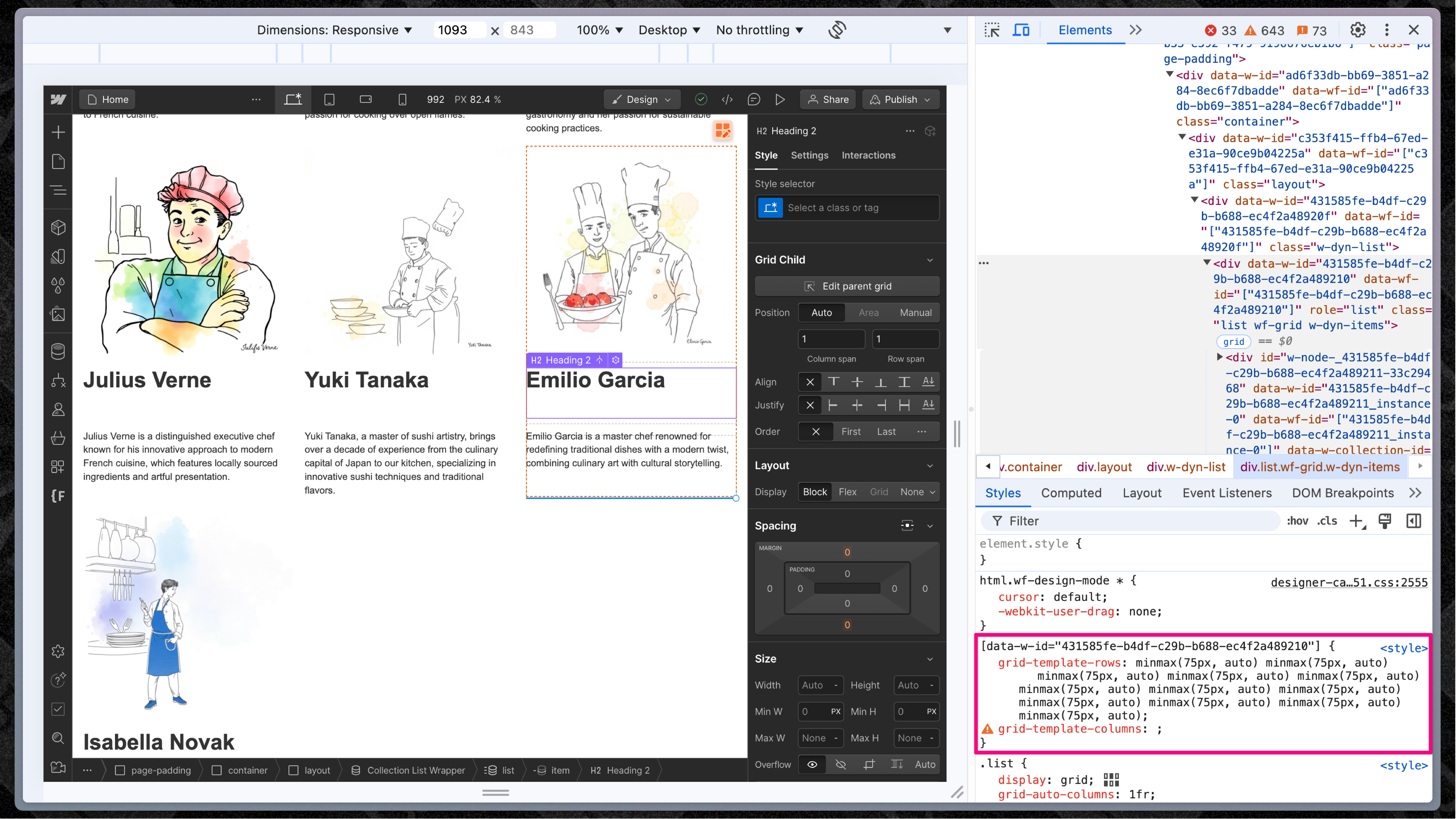
An important note for my Webflow folks
OK, if you're doing this in Webflow, you've got to know something about designer mode. Webflow sneakily assigns unique IDs to every grid cell. In addition to that, in the style sheet in design mode, they set the grid-template-rows for any item set to grid (from the UI) to have minmax(75px, auto). Webflow does this so that on canvas, the grid takes up space by default and is clickable. That's unfortunate for us, because it might look like the work we put in to make everything aligned (simple 4 step process FTW) was all for naught. There's an easy fix by overriding this tomfoolery from Webflow.
.grid-parent {
  grid-template-rows: auto !important
}
Alex and I discovered this during his live stream, and we chatted about it on X.